The user has left the building
When you work with User Experience (UX) for sure you already came across the quote: “UI is like a joke. If you have to explain it, it’s not that good”. User Interface (UI) design aims to make it easy for a user to interact with an app. It’s main purpose is to ensure an intuitive usage of the app: where to enter data, how to navigate or trigger an action. A user should be able to use the app without having to attend a training first.
Compared to UI, UX is a more holistic approach that goes beyond the interface. UX is about the complete experience when interacting with a service, product, or tool. For instance, a grocery store can have a super app with the best UI imaginable. It makes it super easy for a customers to select groceries, add them to their shopping cart and let them buy it. When the purchased items are not delivered, or some are missing, fruit is moldy, hotline keeps you waiting for 30 minutes, then the UX is miserable. For good UI it is possible to focus on a single part of the process, for good UX, the whole process must work smoothly.
Achieving good UI is hard work. As the journey to good UI started years ago in the IT industry, we benefit today from the work of many other people and companies. Today, you do not have to start from scratch but can build your UI on best practices, guidelines, templates, etc. Apple and Google offer great resources. SAP provides the Fiori Design Guidelines that are an excellent guide to achieve great UI for apps, as well as the technology to realize the app. To put it bluntly: everyone can create an app with a good UI following the Fiori guidelines.
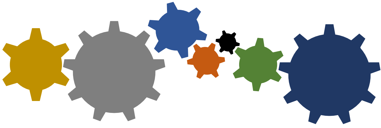
Good UX however is harder to achieve. It’s not enough to focus on a single app to offer great UX. Several independent parts must play together. Look at the graphic. Each piece is necessary to make the whole chain of gears rotate. If one is stuck, broken, or missing, it won’t work. The user might only interact with one, yet each gear is important. For UX: each gear is a part of the overall process. One is the UI, one the servers, the hotline, etc. All pieces together form the UX. This is way harder than it seems. Not always these parts are immediately visible. Or are controlled by the same team. Or are intended to be used by a common user group. What they have in common: if one part of the overall process fails, it has a direct impact on the UX. And the user does not care if it’s a single tool to blame, for the user the whole process is broken.
While for UI it is possible to depend on templates and a wide range of tools, for UX you have to use your brain. This is a challenge. You have to find out what can impact the UX, can fail or get the user stuck in the process. How to handle errors, what are the components involved, the possible interactions? From the above grocery store example, for sure you can easily find out hundreds of interaction points that can lead to a bad UX. Just think about it for 10 seconds and you come up with: it is raining, where to put the box? Last item in the shop is reserved online, what if a customer onsite is buying it? What purchase options to accept and how to handle purchase failures? I hope you realize that good UX cannot be taken as granted.
Why am I writing about UX? This is not a blog where I post UX tips & tricks or how-tos. I am writing this because I regularly stumble over a bad UX that showed clearly that UX is complicated; – even for companies that spend a significant amount of money on the topic. Specially the fact that several independent parts must play together shows whether a company has internalized UX or not. Considering that SAP is marketing S/4HANA and their “new” Fiori design to make everything easier for the user, I am always surprised that the company constantly fails to deliver an UX that shows that SAP takes UX serious.
For example, I wanted to access the SAP training site. What I got was an error page.
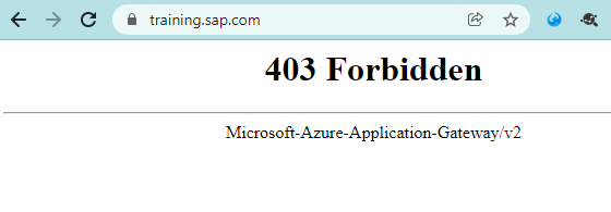
So far, so good. Errors can happen. My guess is that someone upgraded some backend servers (or removed some) and my browser sent some cookie information that redirected me to a resource I do not have access to. This is “solvable” by the users: clear cookies & cache and it should work again. Now, put yourself into a normal not tech savvy person. What you get is: English text, a number, and some additional technical info from Microsoft. A technical error message is not what you want. It is better to have custom error pages that help the user to understand what is going on and how to solve it:
How could the error be presented to the user?
What happened? -> Permission denied: This site is protected, and you don’t have permission to see it.
Is this error actually an error, or planned maintenance? ->Ups, sorry, this page is under maintenance, please try again later.
Should the user get this error? -> Wow, that is unfortunate, we are sorry that this happened. Something is wrong. No, it’s not you, it is us.
Is there anything the user can do to solve this? -> Can you try to clear your browser cache? Here is a how-to. If you are using Citrix (we are so sorry for you), please provide this information to your admin.
The above example shows: the actual error won’t be solved by this, but at least the user is not left alone. The user sees that someone anticipated this kind of error, meaning this is not completely unexpected (aka they are aware that this can happen. No reason to panic). Maybe someone is already working on it. Even a simple error page is work. Done right, everyone benefits (Twitter, Fail Whale, GitHub, YouTube). One might state that the error page is provided as-is by Microsoft and SAP cannot change it. As an end user, that’s nothing you should care about. SAP needs to ensure a good UX, and if Microsoft would not allow that, it’s SAP’s task to ensure they allow it (spoiler: custom 403 is possible).
The 403 error by the application gateway is just one piece. Another very important piece for UX is the human interaction – aka help desk. Context is super important. A user that faces a problem and interacts with different support persons should not have to explain it over and over again. Support tools changed drastically from simple ticket systems to knowledge management systems. Serious investment was done in the last decades. These tools can today be used to find solutions in seconds, escalate incidents to the right persons, get an overview of the incident history, person, service or analyze the sentiment of the communication. I admit that on Twitter the SAP Support is getting better. It’s not any longer just asking to open a ticket. It is however still not how it should be. Reading through the thread, understanding the problem and issue is sometimes somewhat behind expectations. In the given example where the SAP training site was not reachable for some users, SAP Support was eager to help (great UX), yet it seems the tools they have are not helpful (bad UX). One interaction was on Friday, with no result until the community brought the issue up on Monday. Several people shared how they fixed it (great community), only SAP did not provide this information, and honestly, so far besides a “working now” (not from SAP!) nothing was shared. Why did it happen, what was the solution, what is planned to ensure that this is not going to happen again, and that the user gets a better UX? Maybe SAP should invest in a tool that better manages Twitter communication for their support staff?
This might be considered as an isolated problem, that only happened once in a decade. But: no. Let me share the UX issues I had when interacting with SAP in just a few days.
Authentication
Another issue was an error regarding missing authentication on the SAP Developers site.
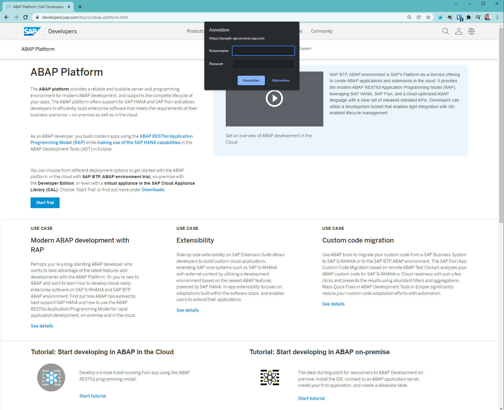
The site is accessible for anonymous users, yet: popup appears that asks for my crendentials. Why? The site is trying to read bookmarks from a service.
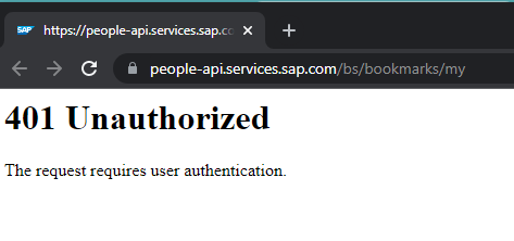
Why reading data from a protected service when the site is accessible for anonymous users too? Seems that the person responsible did not consider the case of a user that is not logged on when accessing the page. Should be caught by testing. Can happen, but this small error makes the whole site look buggy.
Misleading content
At the same page I came across another small issue. UX also means to not confuse people too much. Look at the second paragraph and the link to Downloads at the end.

Click it and you are directed to the section Under the Hood
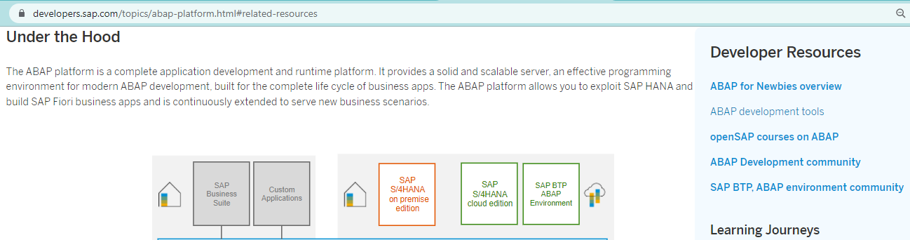
Don’t ask me where the download section is. The title and content for under the hood is about the details of the ABAP platform. In the info box, however, there are further links to download the developer edition and access to CAL. But why is the text of the link than labelled Download and not under the hood or simply: look at the links or developer resources?
For both SAP developer site related UX issues: the content of the page is good. Someone really put effort in making it easy to find, read and get value out of the provided information. Just that this piece is just on part in the overall user interaction. Not to mention that many information you can find there relates to a NetWeaver ABAP Docker image, that SAP took down (thanks SAP lawyers). While there are individual parts that did a good job (information, software), the overall UX leaves room for improvements.
SAP Notes search
Searching for an SAP Note I got an error. That’s like the worst case for UX. You already need to consult a note because of some issue that you have with SAP, and instead of getting an answer, you get another error.
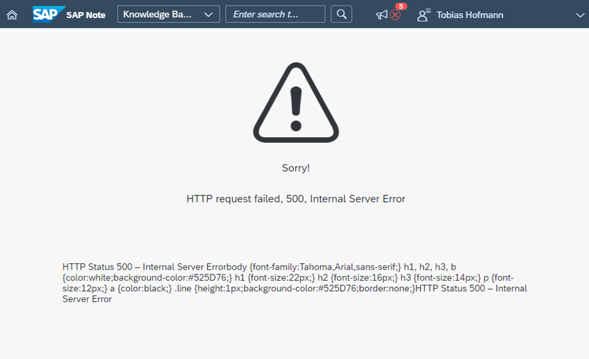
Getting random HTTP 500 errors while searching for notes is not nice. If you search for notes, you already have a problem that you need to solve. Least thing you want is facing another problem while trying to solve a problem. The error page is nice, the icon makes it clear that something did not work, the text was made by someone that knows that an error message must not be fully technical. Yet, why the paragraph with useless information? The inception error message: when the error message contains errors.
SAP did a great job with the support launchpad and the notes search. Considering that the app was almost unusable when released, tremendous effort was done to improve it. So we have a good UI, not so good UX due to HTTP 500.
Note updated
That’s a classic. It comes up every few months: the note you need is being updated by SAP and you cannot access it. Not even a previous version. Latest iteration: 31. Jan. 2022.
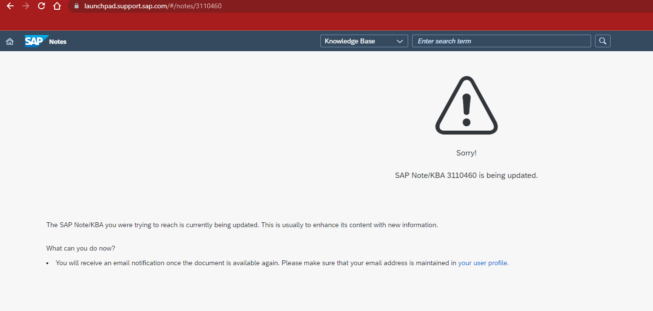
This is an UX issue since decades. It does not help to have a great UI for the notes search when the user is not taken into consideration in the whole notes publishing process.
Marketing
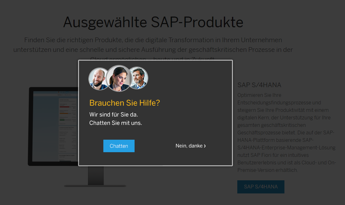
Another classic. Reported as “not nice” by many people to SAP. Fast forward a few years: not changed. If you go to an SAP product site to read about a product, you’ll get a popup asking if you need help. Every! Single! Time! Nothing better when it comes to customer interaction than to interrupt them when they try to focus, read and understand a document.
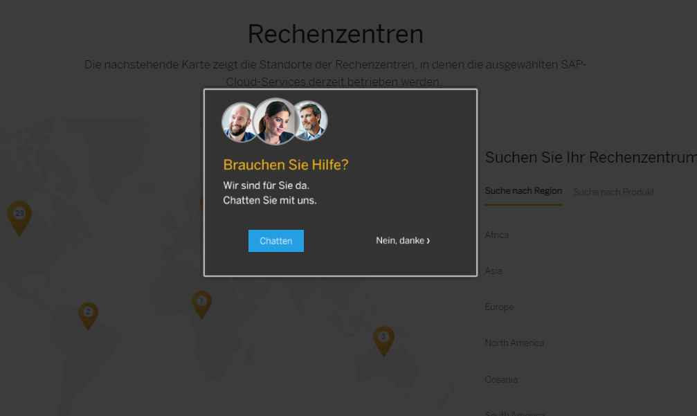
SAP Data Center list
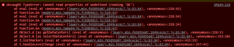
I came across this on SCN, and while it is working again, another bad UX example. The list of SAP Data Centers did not work.
Why are there no data centers shown in the map? The log shows that something goes wrong when trying to read a property DE. It seems that the site is not working when your browser is using German?
Btw: while writing this and checking that the data centers are shown again, guess what happened:
AppGyver Login
Even companies acquired only recently do not perform any better when it comes to UX. For instance: AppGyver. Try to log in to their no-code tool.
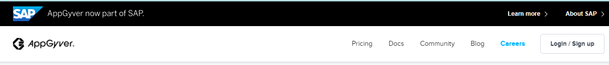
The control is labeled “Login / Sign-up”. For some reason someone thinks it’s a good idea to always present the sign-up form. Because the sign-in link is at the bottom of the sign-up form. A link you only find when your screen resolution is high enough. If not: happy scrolling.
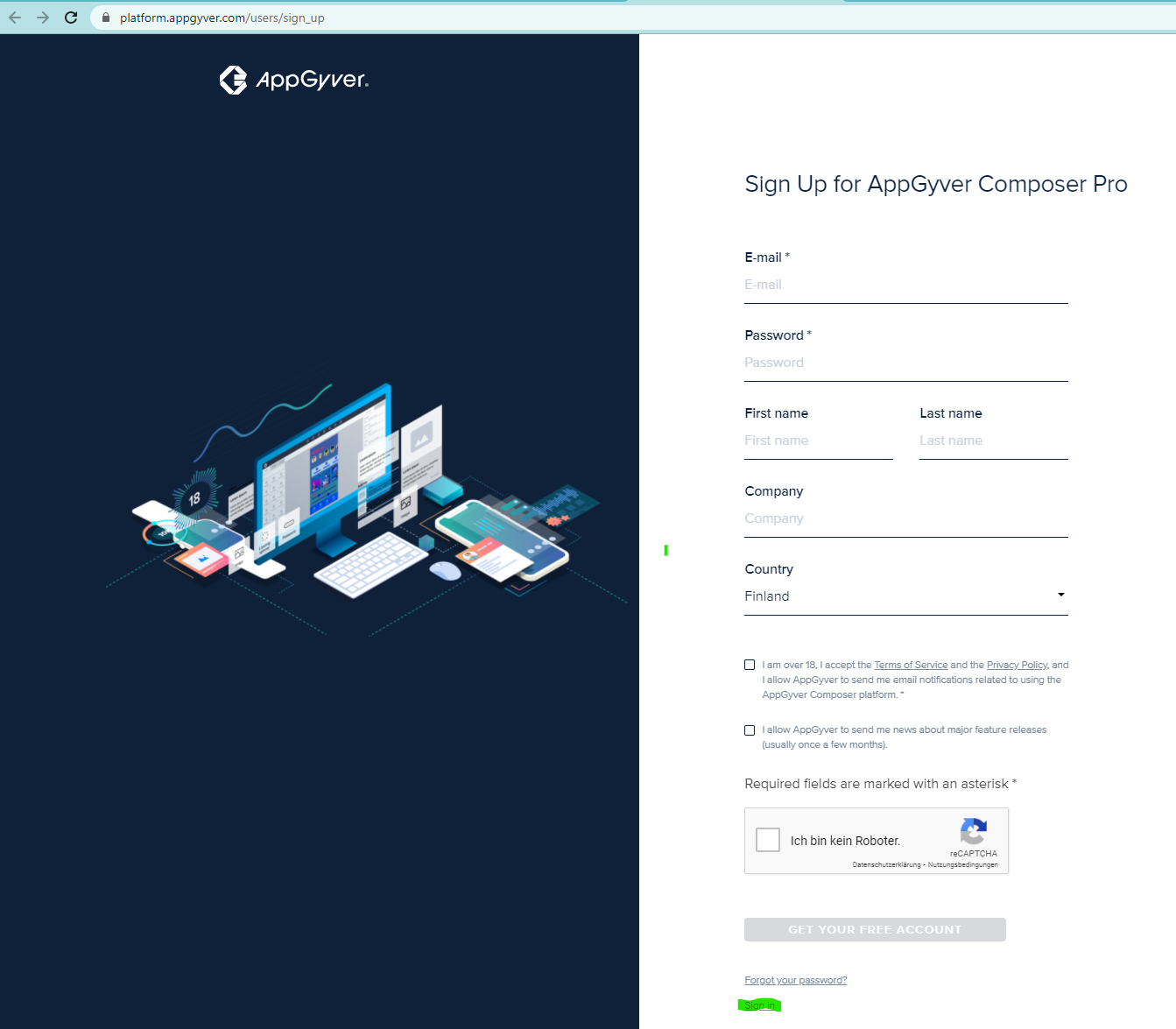
Again: the UI for the forms – sign-up and sign-in – is not bad. If you do not try to log on via a smartphone. But the UX can be improved. Note also the default selected country: Finland. Instead of trying to use what the browser sends.
Where is the CUXO?
Individual teams try to do their best. As stated above, its many parts. Some teams are good in providing great UX for their part (here, here, here, here, here, here). For the whole UX process form the user perspective, their part is just a tiny piece. Their effort is than contradicted by other teams just don’t do their homework. The possibility to not be able to go through any interaction with SAP without running into at least one severe UX failure is way too high. As you can see from the above examples, even basic interactions fail regularly.
It really surprises me that this is the case. SAP invested heavily into improving their UI. There are many people involved in UI topics at SAP. They have a Chief Design Officer (CDO). Then why is SAP’s UX not top notch? SAP’s focus is on design. Basically: How to improve and apply the Fiori design in SAP products. Individual teams deliver their part for Fiori, ignoring that the user is interacting with many different teams and therefore parts. Who is the owner of these user driven interactions at SAP? Where is the person that takes responsibility for the UX? Where is the Chief UX Officer?
A simple example is SAP events. Apple invited last year with an “easter egg”: an invite enhanced with some stunning VR. At SAP, you are happy when they get the time zone right. I believe one reason why SAP is incapable of delivering great UX is that they do not know how to interact with users. Apple, for instance, is selling their products directly to users. Their business is based on happy users. SAP’s business is based on making the person that pays the license fees happy. There are better conditions to offer a great UX for the users.
0 Comments