

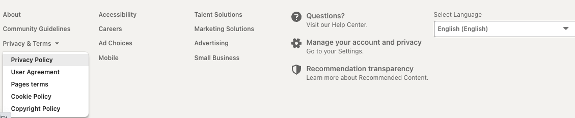
I navigated around some Oracle sites.
- Oracle Homepage 🔗
- Oracle Developers Events 🔗
- Blogs 🔗
- Investor Relations 🔗
- Oracle Developer Live 🔗
- Forums 🔗
- Oracle Education 🔗
- Oracle MyLearn 🔗
- Documentation 🔗
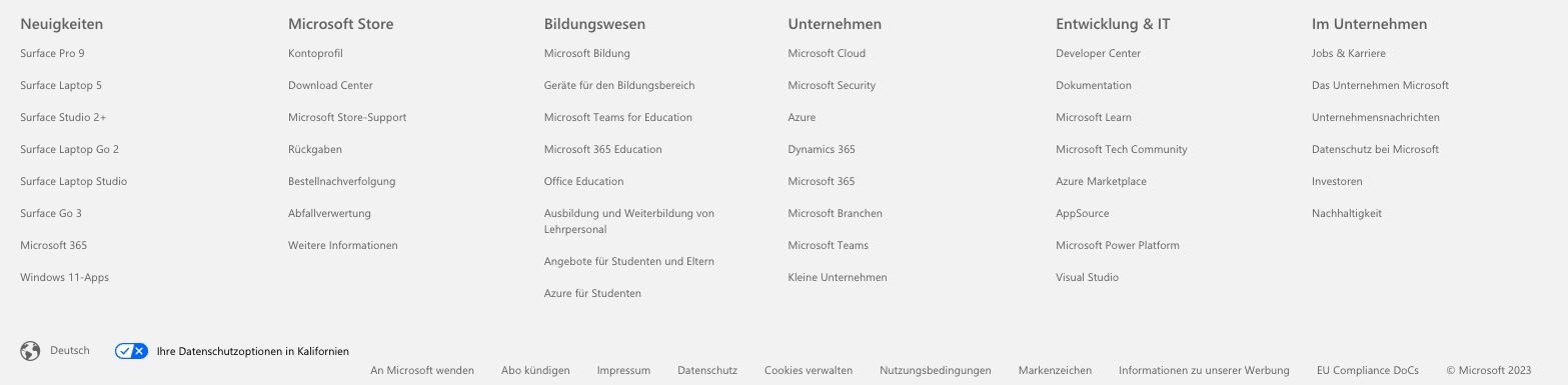
Here are the screenshots of the footers of each site.
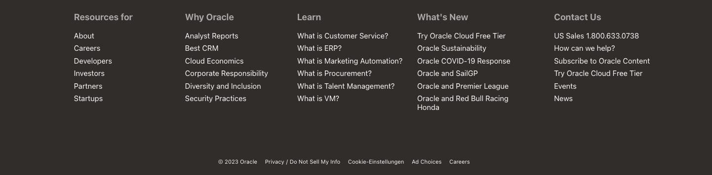

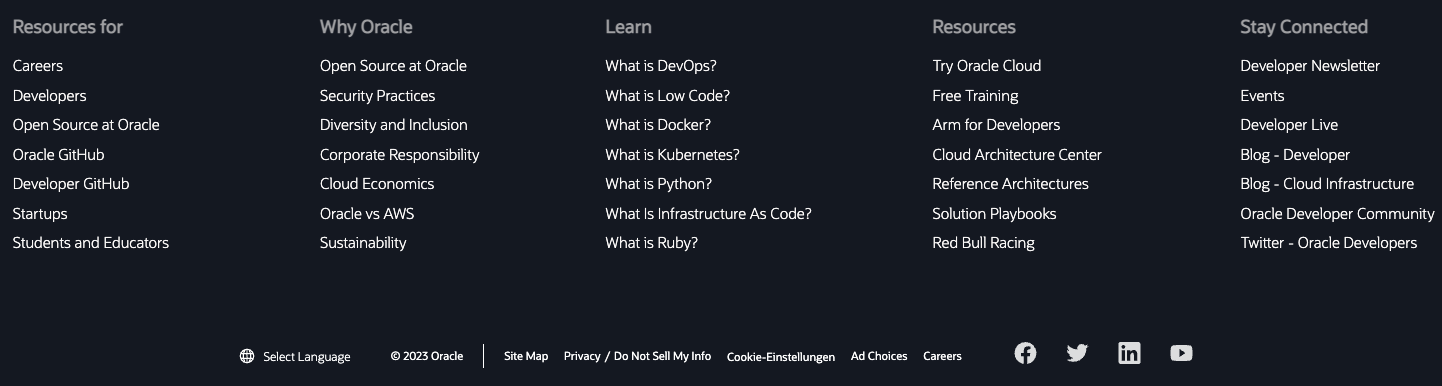

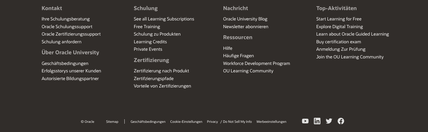
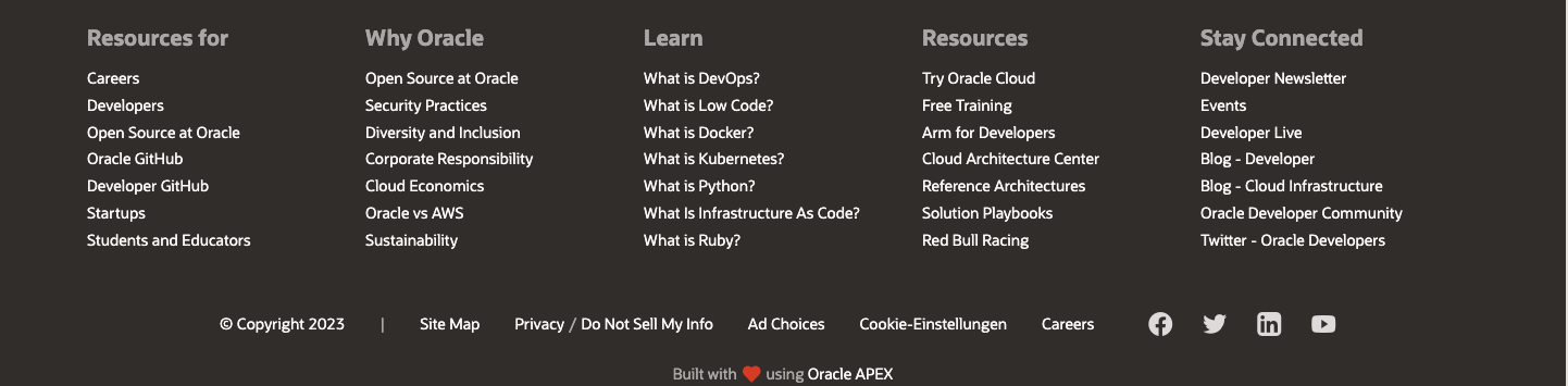
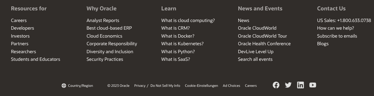


Example footers from Oracle
All of these pages are under the oracle.com domain. They feature different content, headers, partly their own design. The footer is mostly the same. Sometimes there is more information about further content listed, sometimes not. What you can always find is one line that contains some important information. The last line is always there and contains some of the most important information. The Cookie Preferences / Cookie-Einstellungen. Everywhere you navigate to at oracle.com, you can always change your cookie consent. Easy to find, it does not change position all the time.
I navigated through some Microsoft sites.
- Microsoft homepage 🔗
- Office.com 🔗
- Azure 🔗
- Microsoft Build Event website 🔗
- Microsoft Learn 🔗
- Dynamics 🔗
- Microsoft Store 🔗
- Xbox 🔗
- Microsoft Developer 🔗
- Microsoft Careers 🔗
- Power Platform 🔗
- Azure Marketplace 🔗
- LinkedIn 🔗
Here are the screenshots of the footers of each site.
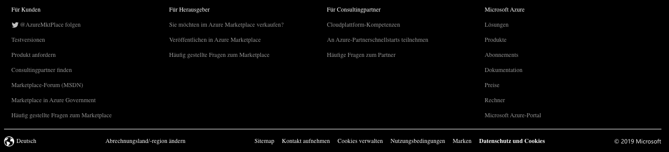

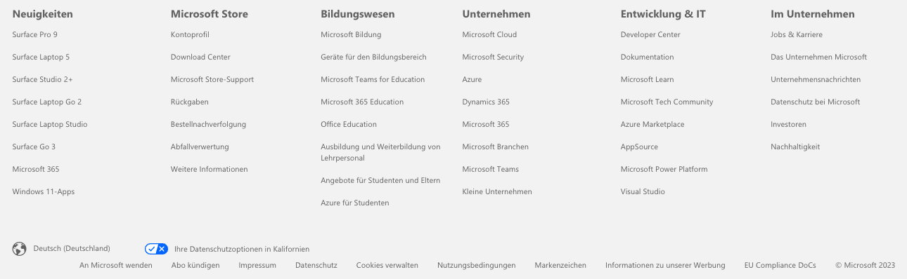
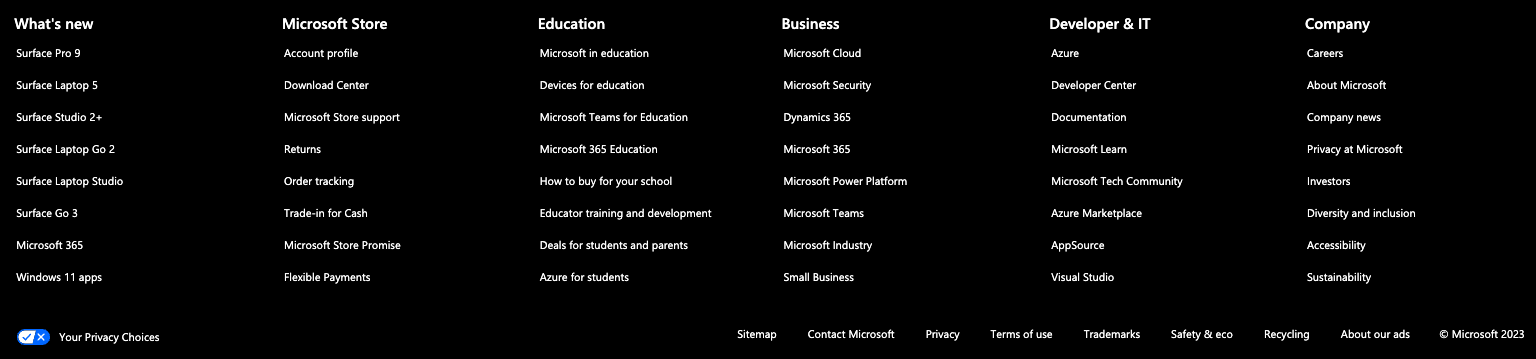


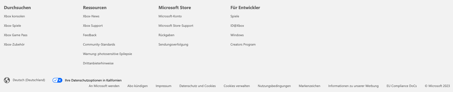
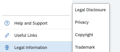
Example footers from Microsoft
LinkedIn is little bit different. But that is caused by the infinite scroll concept. If there is no end of a page, then it is impossible to place a footer at the end of the page.
Microsoft also does not treat the footer as something static that needs to be equal for all sites. But what they do is to ensure that there is also a last line included everywhere that ensures all required information is easily accessible. Just like Oracle, there is a last line in the footer that contains some important information for the user. Other links in the footer are more like additional information regarding the current site. To manage e.g. your cookie consent: scroll down to the footer and there the options are available to you.
I accessed some SAP sites.
- SAP Homepage 🔗
- SAP App House 🔗
- SAP UX Community 🔗
- Me 4 SAP 🔗
- SAP Community 🔗
- Fiori Design Guidelines 🔗
- Fiori Design Guidelines for iOS 🔗
- Fiori Design Guidelines for Android 🔗
- Sapphire 2023 (logged in) 🔗
- SAP Universal ID 🔗
- SAP Partneredge 🔗
- SAP Discovery Center 🔗
- SAP Business Accelerator Hub 🔗
- SAP Development Tools 🔗
- SAP Training 🔗
- SAP Learning 🔗
- OpenSAP 🔗
- SAP TechEd 2022 🔗
- SAP Event (random one) 🔗
- SAP BTP Cockpit 🔗
- SAP Store 🔗
- Don’t forget the other SAP Store 🔗.
Here are the screenshots of the footers of each site.
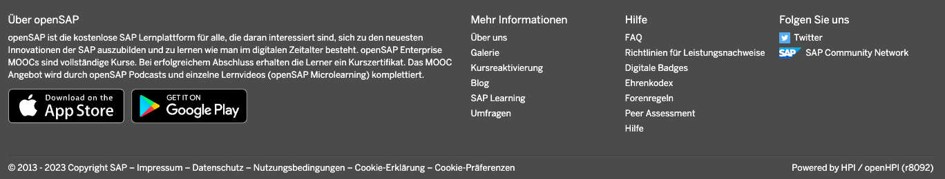


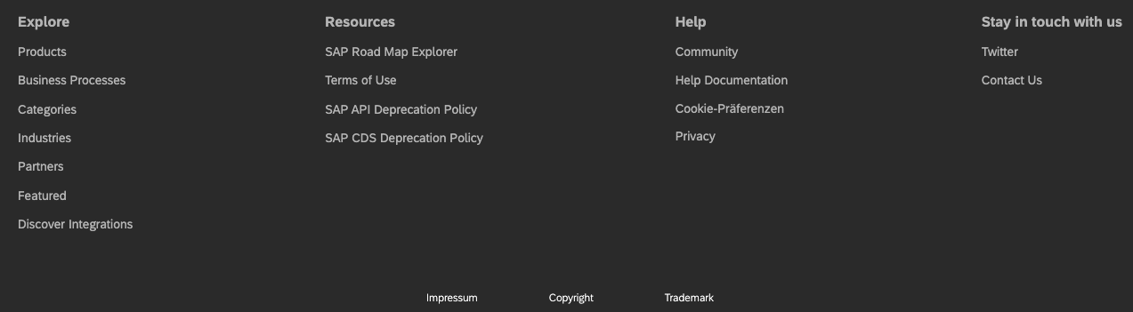

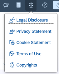


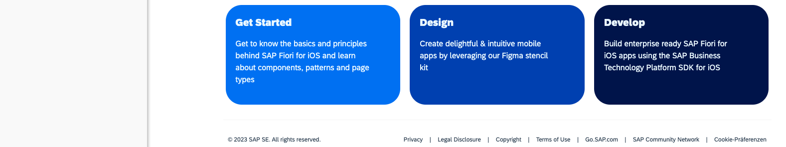

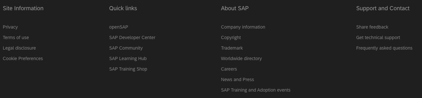

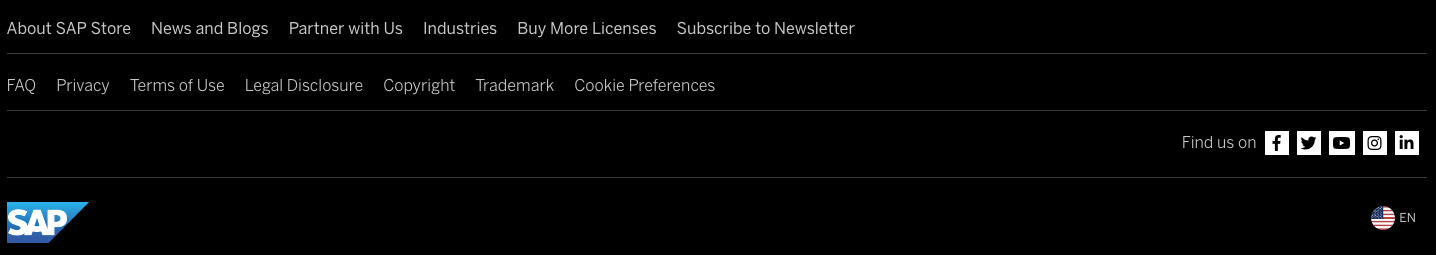
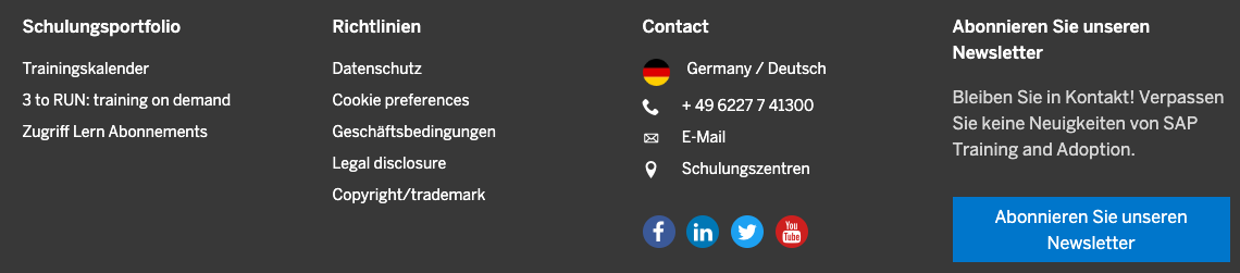


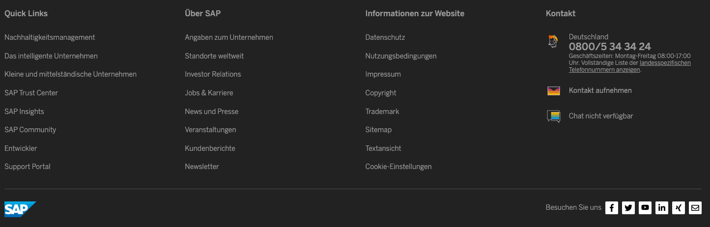


Example footers from SAP
(I super like the other SAP Store. Like, what? Why?)
For both Oracle and Microsoft, the overall layout does not change too much. Some footers are larger because more links are added. But the mandatory part is basically one line. It seems that some people are talking to each other, to ensure that some internal and most importantly, external requirements are met. And that the end user is capable of finding fast and effortlessly required information. Maybe different executives and teams from different areas are checking that what they want to do fits into some recommendations? So that they do not have to come up all the time with reinventing the wheel when all they have to do is provide information to an external audience?
Regarding SAP, you can see that the concept of a footer, how it should look like and what to offer is an ongoing controversial discussion. This discussion is going on for years and I doubt that until the end of extended Business Suite support we will see an end coming to it. To an end that offers at least some benefit to the users of SAP’s website. In case you are asking who should benefit. The current state is great, as we are witnessing the brainstorming phase. Individual brainstorming results are delivered in an agile process direct to production. A user navigating SAP sites can witness how several ideas for the footer are tested in production, at the same time. Company image position, social media following actions, putting some required information like cookie consent in the last line of the footer, or make it part of the link list. Or even into the header. It seems that there is no guideline nor guidance at SAP regarding what, how and where to put legal information into a footer. Sometimes important information is categorized as Help, Guidelines, Information, sometimes it is put at the last line.
The SAP sites are a highlight of individual creativity. Some people live out their dreams. From header to footer. Not like this isn’t possible at Oracle or Microsoft too. It is, just look at the links shared above. But, well, people at SAP want to live out their creativity harder? My highlight was the Fiori Experience for iOS and Android where the footer content for Android is very minimalistic. If not to say: maybe missing some important information?
My impression is that the responsible (Executive/Vice) Presidents, Directors - or whatever title they might have - are doing what they want in their own little kingdom. My site, my project, my decision. And in case someone raised any concern – and this is a very big if, it was ignored. I’d say that this is not the best idea (see my posts here and then compare it to what SAP changed afterwards on their sites). What I personally do not like about this is the subliminal message transported with it: “ship it as I want it”. It makes navigating across SAP sites an uneasy experience. Perhaps the nobles at SAP can put themselves into the role of the humble plebis and access sites outside their reign?
Of course, you are not always scrolling down to the footer. But the footer can serve as an indication whether or not the site responsible executive does whatever he/she wants. This results in sites that differ widely in the overall design. These sites are from SAP – most are under the same sap.com domain. Yet, you never know what you’ll get when you open an SAP site 🔗. Imagine each SAP sites would come with a different header? Logo added, removed, placed left, middle, right, no header, different navigation, different colors (red, green, yellow), etc. This would be awful, and people would complain instantly. For sure, this wouldn’t even go live. But the same chaos is considered acceptable for the footer. Why for the footer? Because it is hidden at the end of the page, so why care?
That’s from the company that praises Fiori as the best design for SAP customers. One Fiori design principle is universally true: coherent. Maybe all those people responsible at SAP for any public facing website should make coherent as the leading principle.
And that site responsibles are not talking to each other. Well, that is obvious. I cannot count how many times I came across some legally questionable decisions. And these are not a one time finding. Image the responsible persons talking to each other’s like: “look, a mistake happened with my public accessible web site, and I forgot to include some important information and the site calls some services it should not. You should check your site too.” Sharing some lessons learned. Seems more like everyone is working on its own. Why bother other people with such learnings? The result of this is that you can access an SAP website, learn that your e.g., cookie consent is ignored, get it fixed, but only for that specific site. Accessing a different SAP website and face the same issue again, again and again.