Fiori Theme
In January 2023 I gave a presentation about SAP Fiori and how it is used at my employer at a DSAG UI meeting. I talked about a wide range of topics that I have to deal with on a daily basis. Throughout the last months, I received positive feedback on the several topics I raised in my presentation. As I think that these might be of interest for others too, I’ll share some of them also here on my blog. This is the first post in this series and I picked the topic SAP Fiori Theme to discuss first.
SAP Themes
SAP released an impressive list of themes in the past. While most people might now associate an SAP Theme with Fiori, theming was already a hot topic before Fiori. I once worked with the SAP Portal, and the maintenance of themes was one of the ongoing tasks. And theming did not start with SAP Portal. Some theme names that I had the pleasure to work with: Horizon, Fiori 3/Quartz, Belize, Blue Crystal, High Contrast, Corbu, Gold Reflections, Streamline, Tradeshow, Chrome, Platinum. Themes is an ancient topic in the SAP universe. The SAP Fiori theme can be seen as the latest iteration. From time-to-time SAP releases a new theme, promising that now it will make working with SAP even easier. For the non-designer the SAP theme evolution of the last years can be summarized as: from blue to white.

There is always a new theme in the pipeline. Sarcastically, this can be described as: every time SAP hires a new design chief, that person decides to put a dent in the SAP universe and we, the customers, get a new design.
Bold and grey
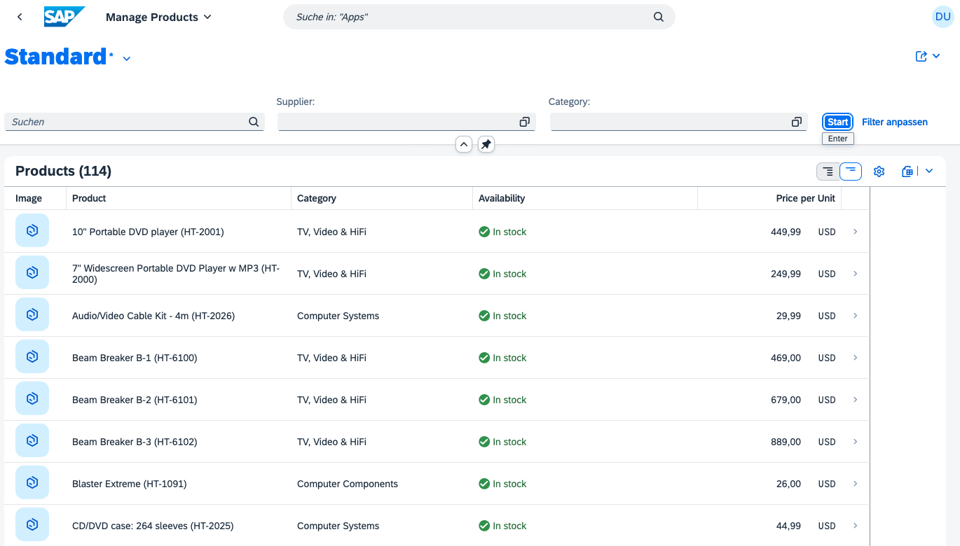
It seems that at least these two points are taken care of by the new version of the horizon theme. The greyed-out input fields are not visually disabled by default, and the bold heading is less prominently taking the focus. If now the view management gets less highlighted and entering search values is not marking the view name with a * (aka: mandatory field). Note that the view name is bold, and big, and has a * behind it. It attracts more the focus than the app name. Standard is the most important part of the app. I think I get the idea, but this is still more confusing than helping. The app here is about managing products. Why is the text standard so prominently placed? If the view already had a given name like Products in stock, or Computer systems in stock, it might make sense and help to understand better the table content. But standard? (btw: waiting for AI supported view naming)

A table that uses automatically 100% of the width would be nice too.

Information display
A better automatic display of input field values would be good. It is nice that the filter bar shows automatically defined filter input fields. But, why not take into consideration if a user filled out a filter? So much space, so little information with +3 others. Ok, I could solve this with a saved view and give it a meaningful name. But that still would hide filter values. And there is enough space available to show them.

Removing flex-basis and max-width gives more space.


Or rearranging the input fields to make as much information visible as possible. Search and category contain no information, why treat them equal to supplier that contains user entered data?

On a tablet / phone, a possible alternative could be show more than one line. Or hide not used filter values (enter values, search, hide not used once). I think displaying as much filter values as possible makes sense for the user.
Example app is from UI5: sample app
Font 72
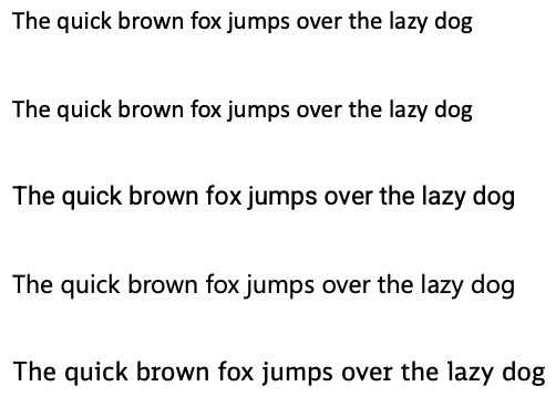
The introduction of font 72 to Fiori is a clear statement: SAP Fiori theme is from SAP, for SAP. Why? Custom font is what companies use in their own themes. It is used to brand their own internet and intranet web sites, to ensure a corporate identity. A custom font is what companies like, even when the benefit is low. Most people do not even associate a custom font with a company. For the ones that say: font 72 is the best font possible, please tell me which font here is 72.

SAP is not using 72 on their own website. They use SAPRegular/SAPBold/etc which is Benton Sans.
Why not use the system default fonts by, well, default? With a standard UI5 theme that uses system default fonts and SAP developing their own Fiori theme, SAP would also have to deal with the normal issues you face when using a custom font. Sometimes a custom font leads to problems, like: spacing. Having to deal with these issues, SAP might experience the effort customers have when they apply a custom font. Maybe as a result this will ensure that the best practices for using your own font are communicated: take a font with spacing x, bold should not add more than y pixel, etc.
Improvement requests
Pointing out that not everything is working as expected is nice. Better is to also provide some ideas on how to make it better. Therefore, I am also detailing now some of my ideas related to the Fiori theme.
Generic UI5 theme
The Fiori theme should be separated from UI5. Every major UI5 release (2.y.z, 3.y.z) should be shipped with one stable base theme. A generic theme, free of any SAP specifics like font 72 or SAP logo. A light, minimalistic, yet fully working Fiori theme. This theme is fix for the major release.
Fiori theme as a project
To ensure that Fiori theme can evolve, several Fiori themes should still be shipped throughout the years. Just like today. Just not as part of a UI5 version, but as a separate project. You can install it like an add-on, but it is not shipped automatically with UI5. The theme project comes with certain dependencies like minimum UI5 version and a defined lifecycle: release, enhancements, support, etc spanning in total a few years. Being an independent project will allow to add features to it that were introduced only with a later – newer – theme. A feature like dark mode. Being independent from the UI5 version means that the theme is e.g. released for UI5 1.120, but also available for UI2 2.0 and maybe even UI5 3.0.
Separate SAP specific Fiori theme
Besides the UI5 base Fiori theme, the additional Fiori Themes, what about the SAP specific Fiori theme? The one theme that we know today as SAP Fiori theme? The custom theme by and for SAP, with SAP logo, font 72? If SAP wants, they can release it as a theme, just like the “official” Fiori themes as a project. It should be treated as a customer specific theme, just that the customer is SAP. For the actual customers, that theme might serve as an inspiration, a template on how to adjust the generic UI5 theme, or the current latest Fiori theme. A side effect could be that the themes, now a project, can also be shared publicly. Customers or partners or consultants can share their own branded Fiori theme via a marketplace or e.g. simply via git.
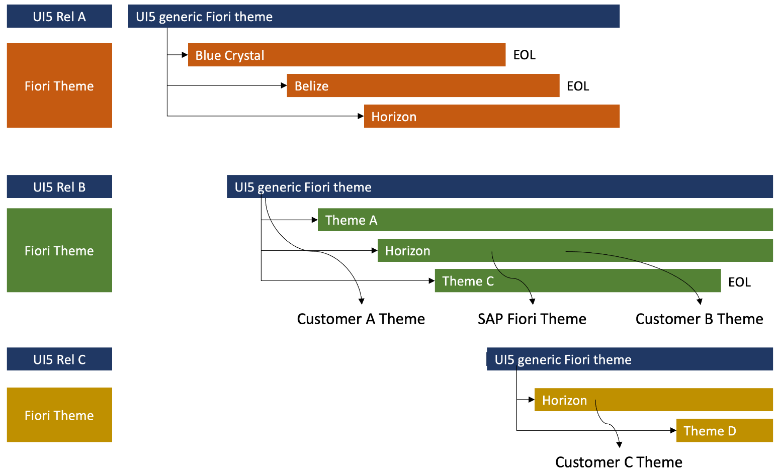
This might seem confusing. I hope the following graphic makes it easier to understand the idea. Take a future UI5 release named B. It is shipped with a base Fiori theme that customer A uses to build its own theme. The base theme is supported for as long as UI5 release B is supported. For new fancy Fiori UX stuff, SAP releases theme A and C. These Fiori themes maybe highlight some super cool AI stuff. Or offer a new level of UI harmonization between the different available UI technologies. There is also the “old” Horizon theme available. As a project, it might have received EOL for the UI5 release A, but not for UI5 releases B and C. Customers can use it to build their custom theme on top of it.

With UI5 release C, the fun continues. Horizon theme is still available, supported and gets new features or supports new UI controls and can be used as a basis for a custom theme. At the same time, Fiori UX continues to evolve with Theme D, adding more AI, AR, whatever stuff.
Standalone theme designer
Create your own custom theme is not an easy tasks. Specifically when you only want to use OpenUI5. In the context of a corporate theme, managing the theme lifecycle could be easier: creation, updates, distribution.
The theme designer should be provided as a standalone tool. The theme designer should be available as a graphical tool, and as a cli tool. The cli tool can be used to generate you own theme using a config file where you can, e.g. define the base colors and the tool generates the theme. This should also allow to integrate the theme building in a pipeline. This would help tremendously in ensuring that themes are always up-to-date.
Fiori theme board
In case SAP insists on shipping their Fiori theme as default for all UI5 users, than at least SAP should communicate better why something is done in Fiori as it is. And open the design process to include Fiori theme users. Customers are buying into Fiori are also committing to Fiori UX. This is mostly an all-in process and a one-way ticket. I think it is fair to discuss the Fiori UX roadmap as early as possible, to influence the main decisions that impact Fiori users.
0 Comments