A professional event app
SAP’s Sapphire starts May 10th. A few days before the official event start the event page is made available. I have written several event sites / apps in the last years, so I can relate to the effort and difficulties involved in creating such an app. I also find it interesting to see how common problems are solved and how content is presented. My latest endeavor in that regard was ABAPConf. Also, for the ABAPConf 2021 event site / app I received comments from SAP employees like: nice, but ugly, don’t you want to use a professional service for this? (Short: We are used better.) Funny as I know that SAP constantly fails to deliver a high-quality event app. So I decided to wait for the next big SAP event and capture the quality delivered by SAP so next time I can refer people to this post when it comes to the quality of my own event apps. And that a team of professionals with the support of a multibillion dollar company don’t necessarily deliver a better event app than someone that does it for free, in spare time, in the evening and weekend. Let’s take a closer look at the event site for Sapphire 2022.
Event page
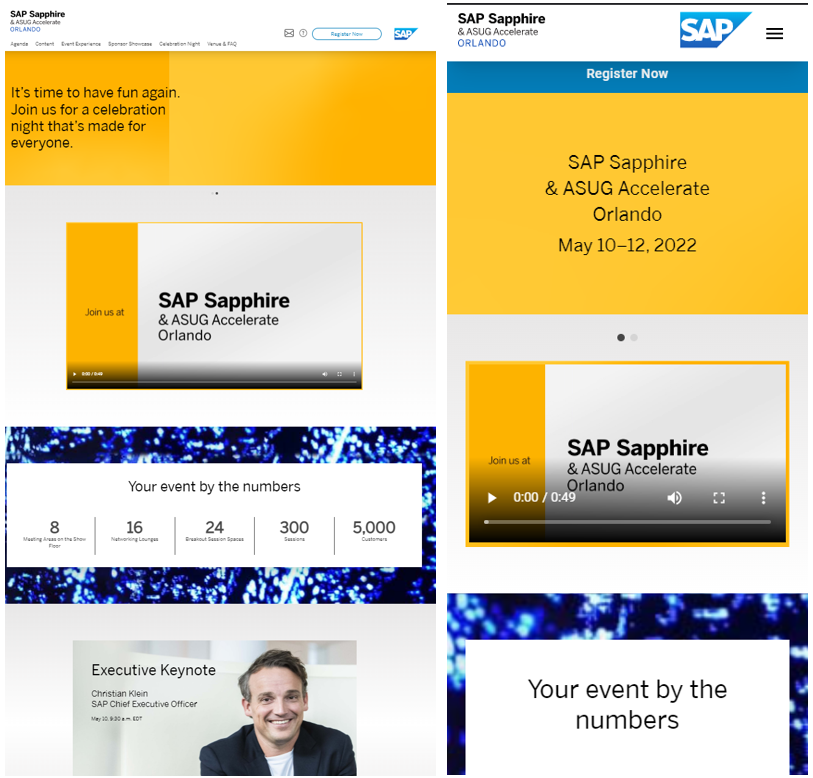
The event page is responsive and is accessible from desktop and mobile.
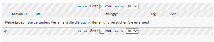
The event page link contains a parameter for the language. I did not see an option to change the language, and my browser is configured to German as default language. Let’s try to change the language to German. After all, SAP is a German company.
https://go4.events.sap.com/sapsapphire/orlando/?lang=de
I have no words.
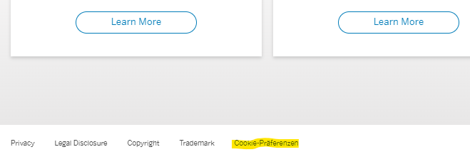
Translatable texts
Trying a different language did not work. The site is not available in German (or any other language) and a fallback language is not set. The only text loaded in German is Cookie-Präferenzen at the bottom
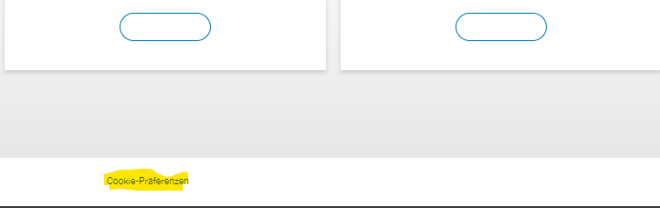
But not because this text is translatable. It’s only available in German. Go to the English version of the page and you get Cookie-Präferenzen.
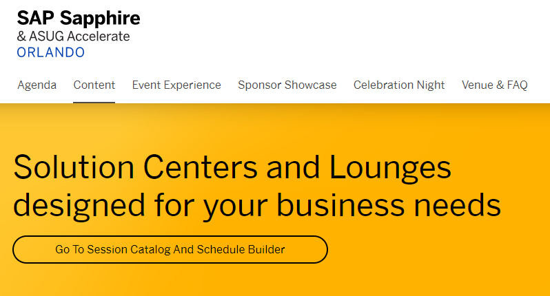
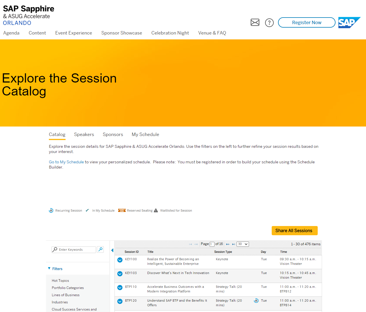
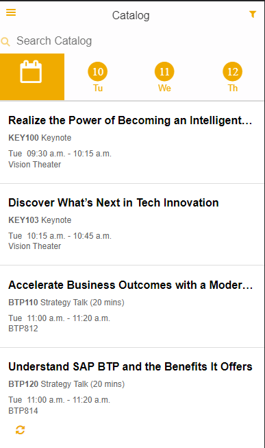
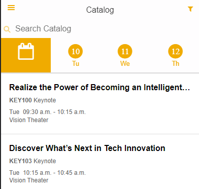
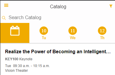
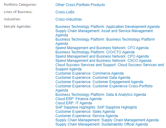
Session directory
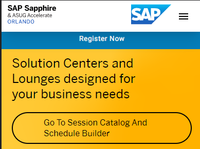
While there is a tab named “Content”, you do not find the sessions under it. In fact, the session catalog can be found via an additional click on “Go To Session Catalog and Schedule Builder”.
Note: when you are at the session catalog, the main navigation is not highlighting any tab. You are not at the Content navigation any longer.
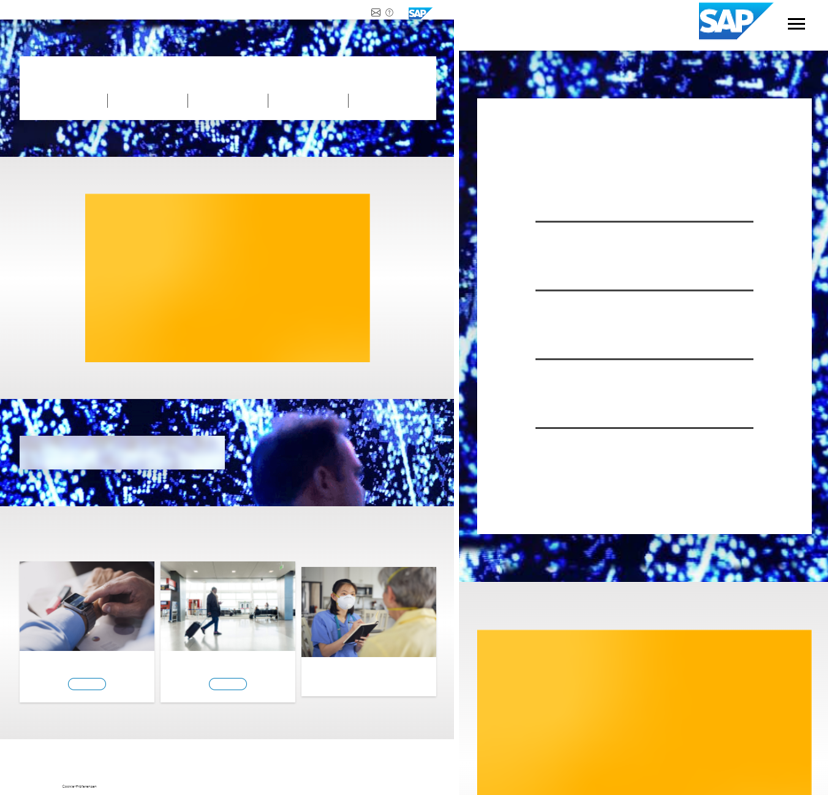
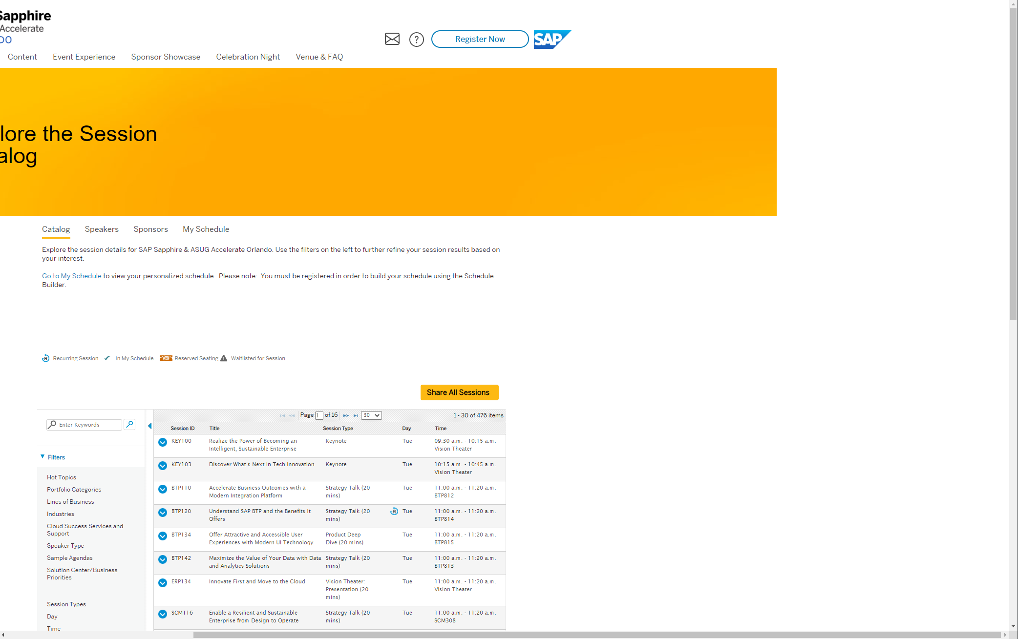
Page layout
You might notice that the page width changed too. The is now a horizontal scroll bar at the bottom
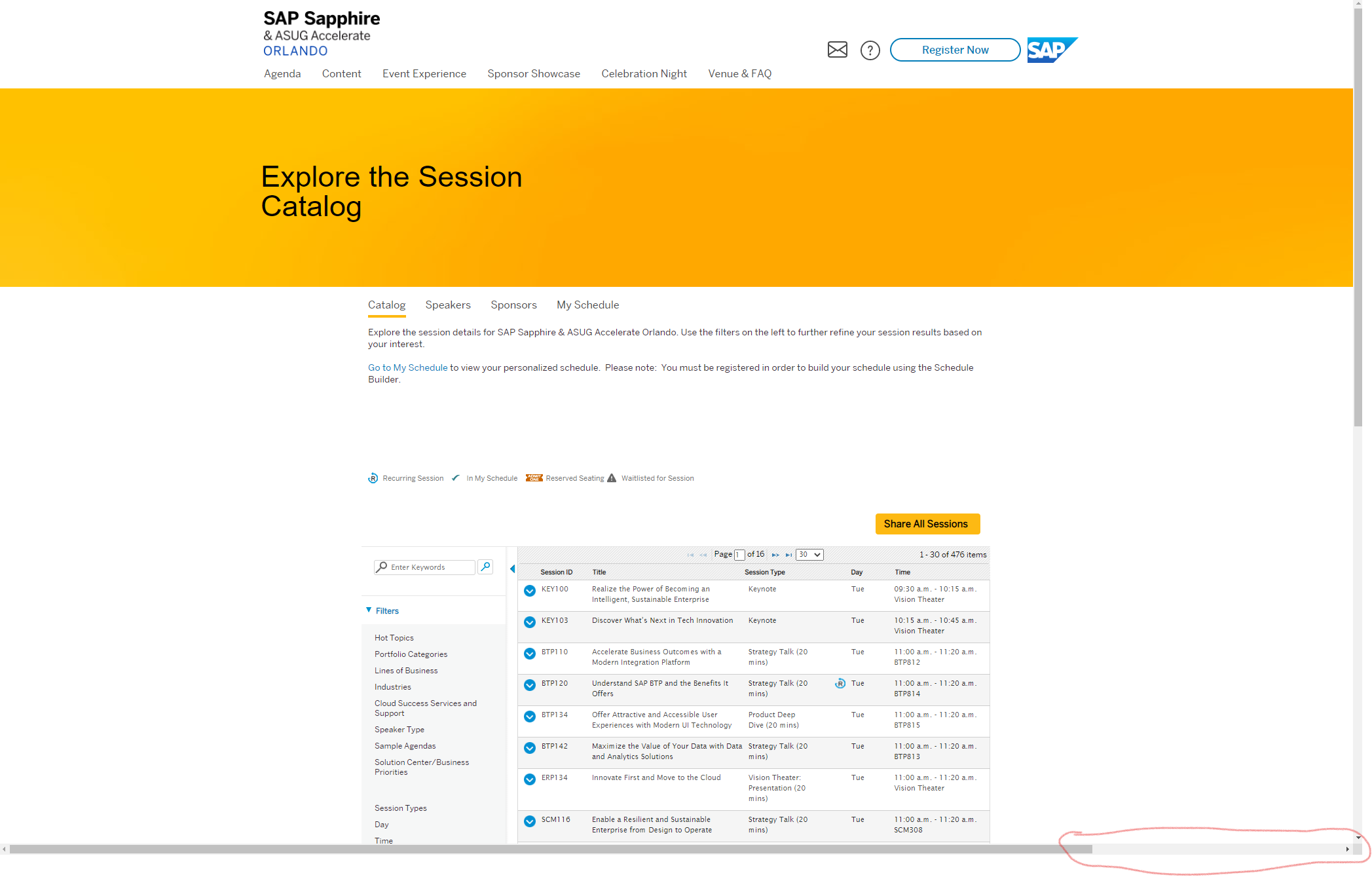
Not that there is not something to find, but you can scroll.
Table
I think I have seen better looking tables.
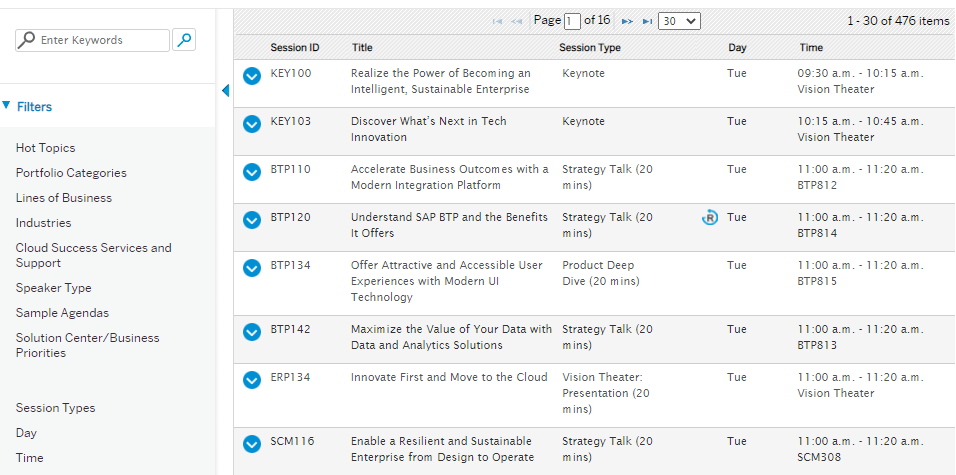
At least the table is available in other languages than English, e.g. German.
The table differs between desktop and mobile version. I like the mobile version better.
Mobile friendly version
Basically, the same as the desktop version.
Except when you find the session catalog and speaker directory.
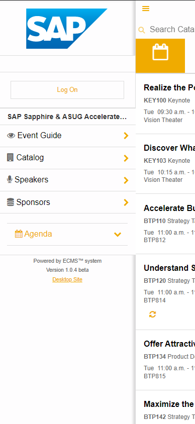
Opening the session catalog gives you a new app. The top navigation changes: hamburger menu moves from right to left.
Opening the menu gives a new navigation. Don’t ask how to get back to the main event page.
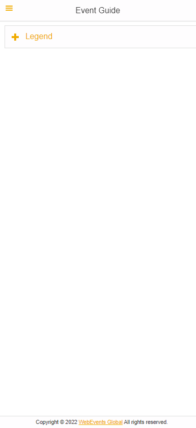
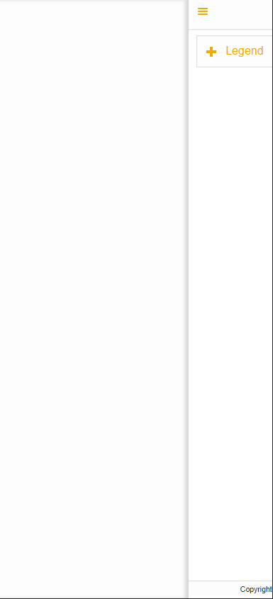
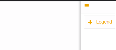
Event guide
The event guide section either only works after registering and logging in or was never tested. I get an empty page.
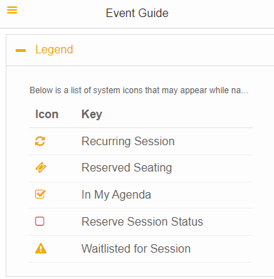
The legend button gives me a legend, and that’s it.
Going back via the hamburger menu is not possible. Currently the event guide is a dead end.
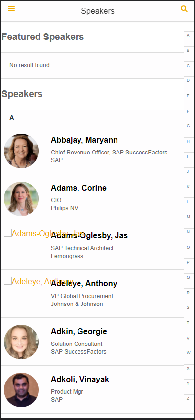
Speaker directory
In case a speaker did not provide a picture, the layout is broken.
Broken navigation
From the speaker directory, you can select a speaker to get details and the sessions of that speaker.
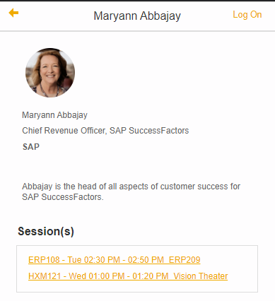
Navigate to a listed session. Note the back button at top left.
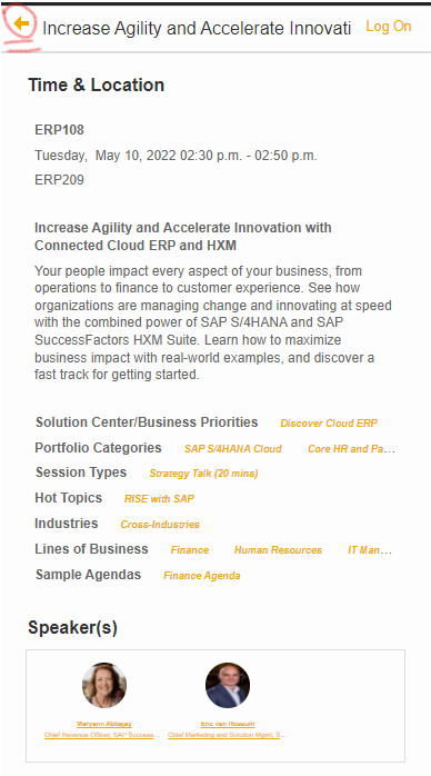
Click it and you are directed to the session catalog. Not the speaker details.
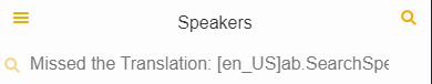
I18n
There is a search option in the speaker directory. Unfortunately, the text is not translated.
Line breaks
I do not know about you, but I like to read the complete also on a mobile device. The session titles in the agenda are cut off if too long.
This is also the case in the session details. For instance, if the tags are too long, they are cut off.
Only in the desktop version you can see the complete list.
Fun fact: in the desktop version, the tags are links. In the mobile version, they are not.
Desktop:
Mobile:
More broken navigation
At several pages you can log on.
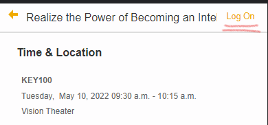
If on the log on page you decide not to log on, you might be tempted to click the home icon.
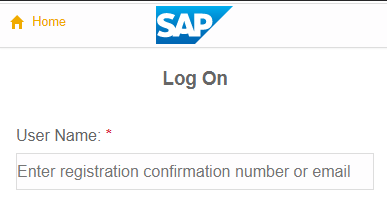
Don’t. This brings you to the Event Guide page, and as we have seen earlier, this is a dead end.
Code of conduct
I did not find any code of conduct for the event.
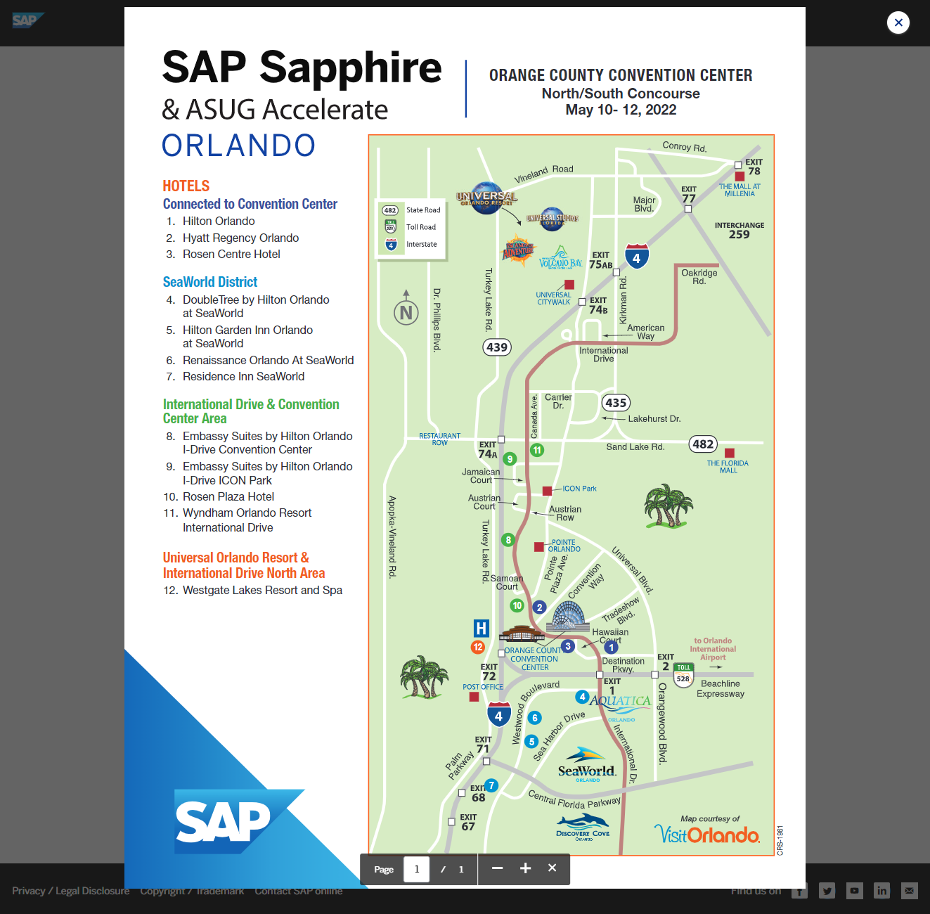
Location Map
There is a map of the location and hotels available. It’s a PDF.
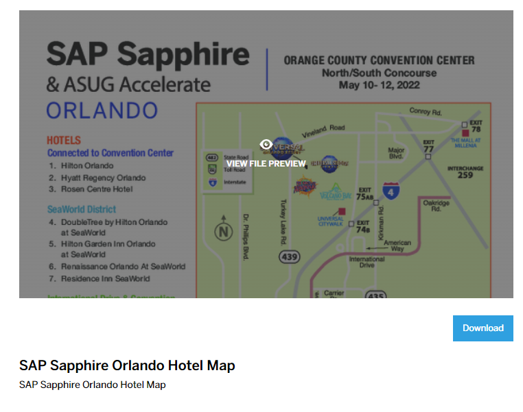
The file is not embedded, to see it you must open it. No Maps integration or link.
Conclusion
There is so much to explore. I am going to stop here as I do not get paid to analyse the app and UX. I think my event apps were not so bad compared to what SAP provides for their main and most important event. In the end, the Sapphire app works. People can find the information needed, and offering an app to tens of thousands of users with hundreds of sessions for on site and virtual attendees with an agenda that spans several days is of course something different than a one day, few tracks / sessions event app. Do not take this post too serious, it is for myself so next time I can point people t to here and let them compare a free, side project event app with a professional event app.
0 Comments